R E B R A N D I N G
St. Jude Medical
Because of a changing healthcare dynamic, St. Jude Medical needed to expand its marketing efforts to target not only a physician audience but hospital administrators, c-suite and patients as well. The original brand was seen as to sterile and was not successfully reaching the intended audience on an emotional level.
I wanted to address these issues but wanted to do so in such a way that differentiated St. Jude Medical from its competitors. I used squares and modular shapes to reinforce the logo which also allowed for graphic space to tell the larger story of disruptive technology. When addressing the issue of emotional connection we intentionally steered clear of happy smiling people, instead our emotional connection was one of partnership and of a genuine understanding of the issues our customers are facing on a daily basis.
MY CONTRIBUTIONS: BRAND TONE / STRATEGY / ART DIRECTION / GRAPHIC DESIGN

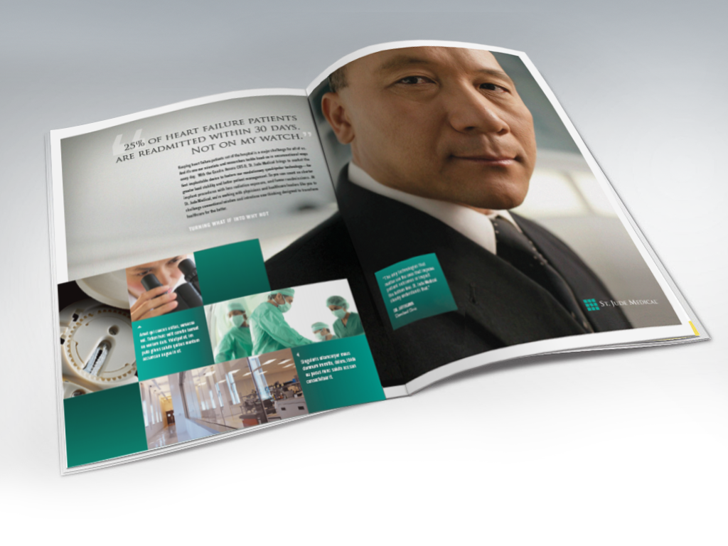
CORPORATE TIER AD
Intended to tell the over arching story of St. Jude Medical as an organization. Focusing on an impactful quote from senior leadership or a key opinion leader in the industry with a sub text narrative speaking to St. Jude Medical innovations.

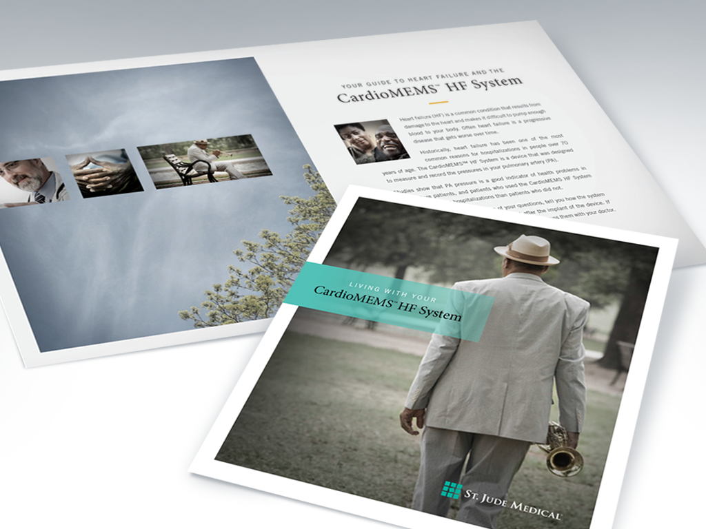
PATIENT MARKETING
Staying clear of the typical smiling face on the cover I wanted to tell a story of the patient and his or her journey to a healthier lifestyle.
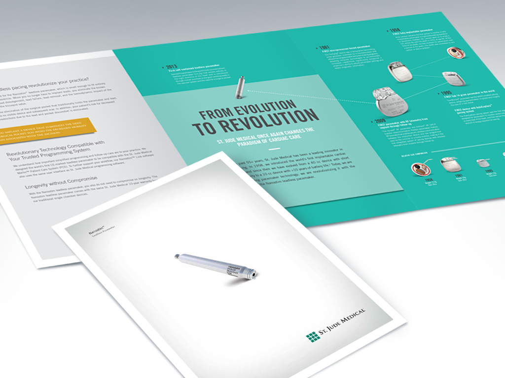
PRODUCT MARKETING
A single fold saddle stitched brochure with a fold out timeline graphic.
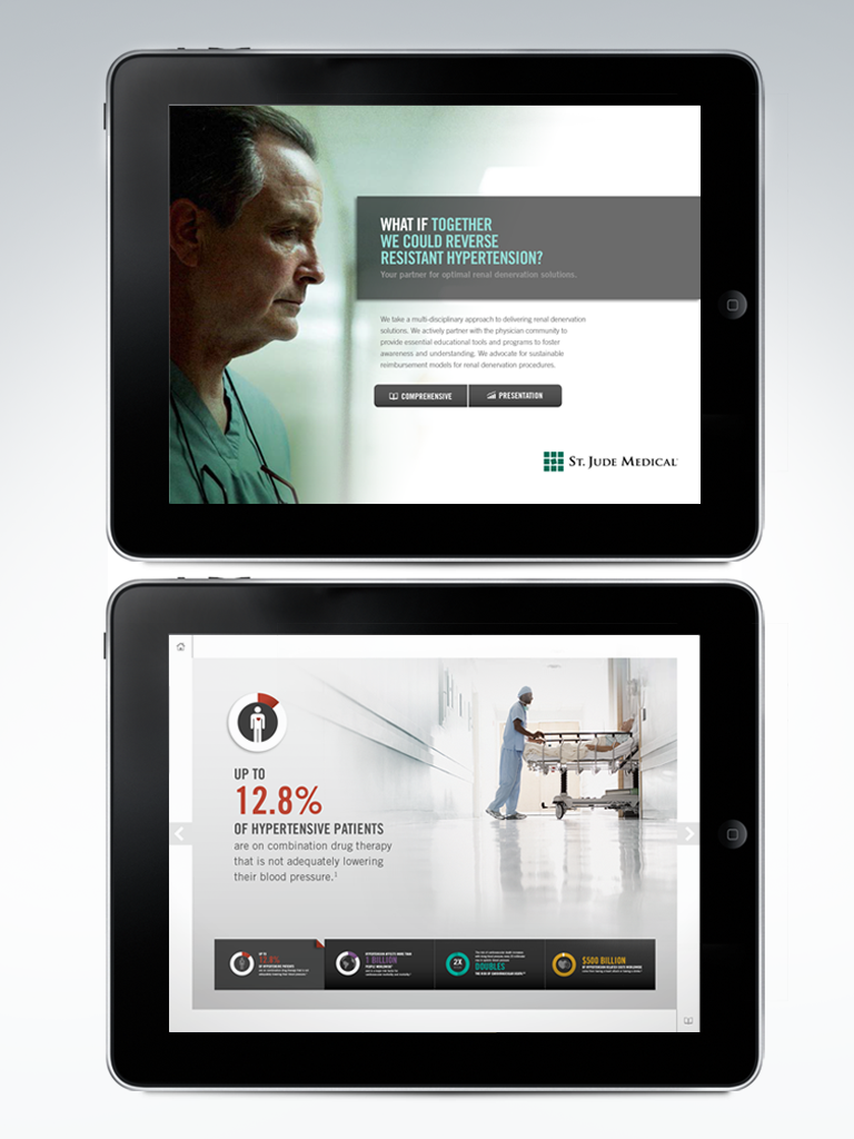
SALES APP
Mobile apps designed to allow the sales rep to navigate product and product benefits quickly and customize his or her presentation.
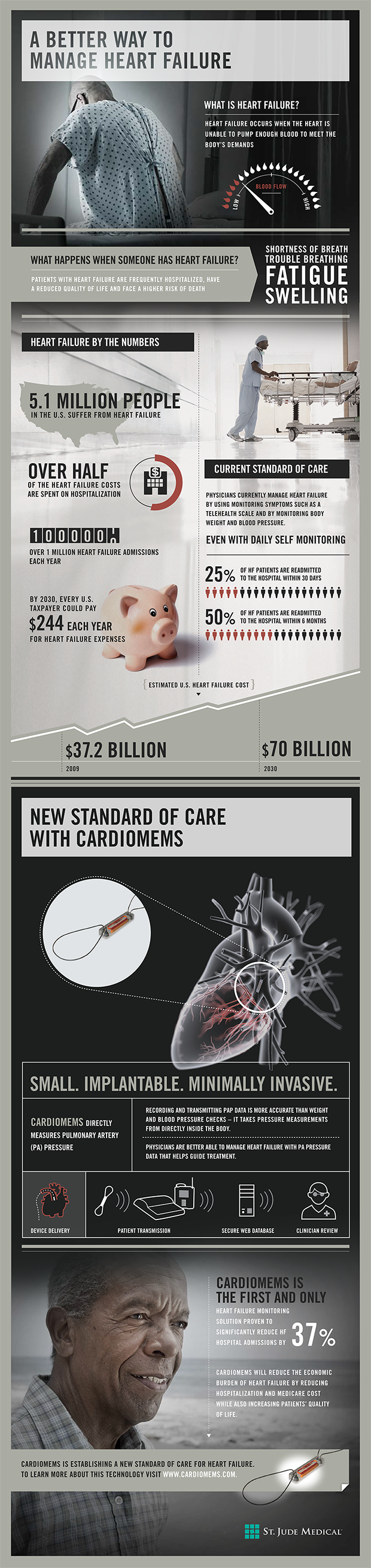
INFO GRAPHIC

B R A N D I N G
Lake Austin Spa Resort
Designed the logo and assisted in the overall branding of Lake Austin Spa Resort. This was a large project that included merchandise, environmental, signage, photography, marketing, print, TV and radio.
MY CONTRIBUTIONS: BRAND TONE / STRATEGY / GRAPHIC DESIGN

LOGO
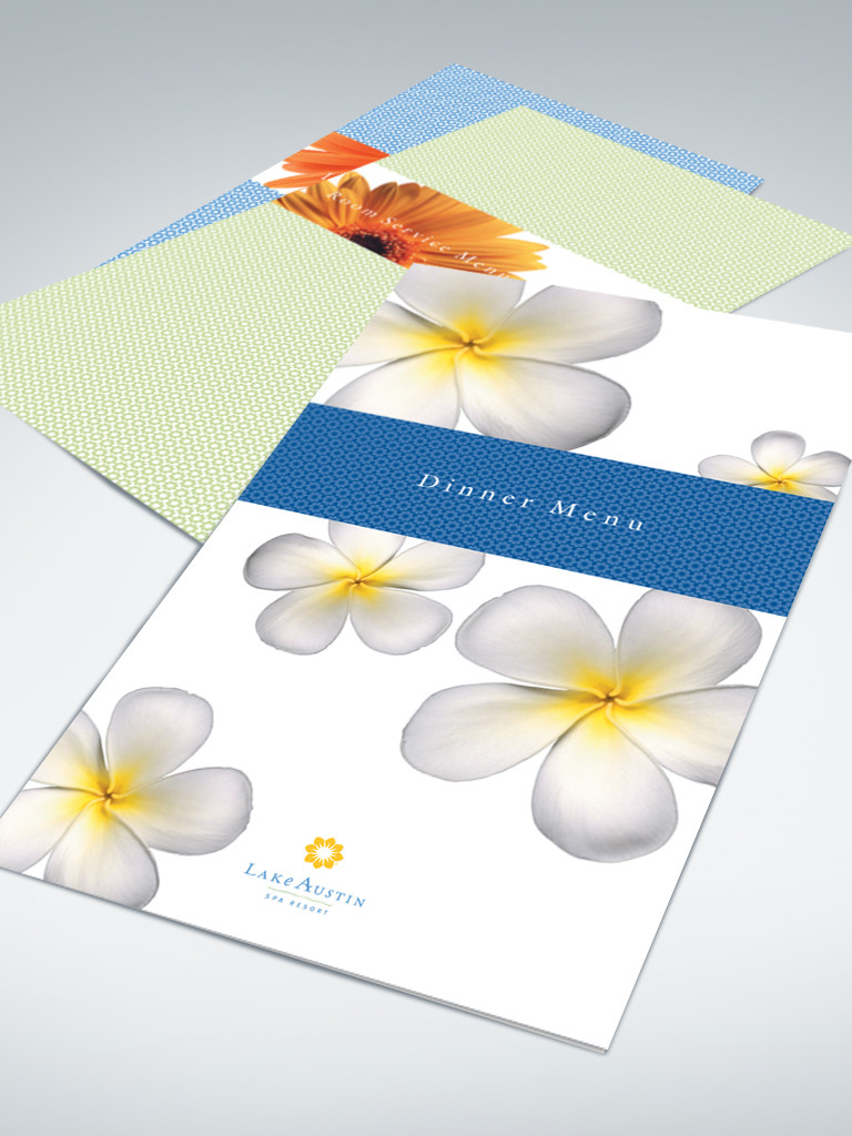
BREAKFAST LUNCH AND DINNER MENUS

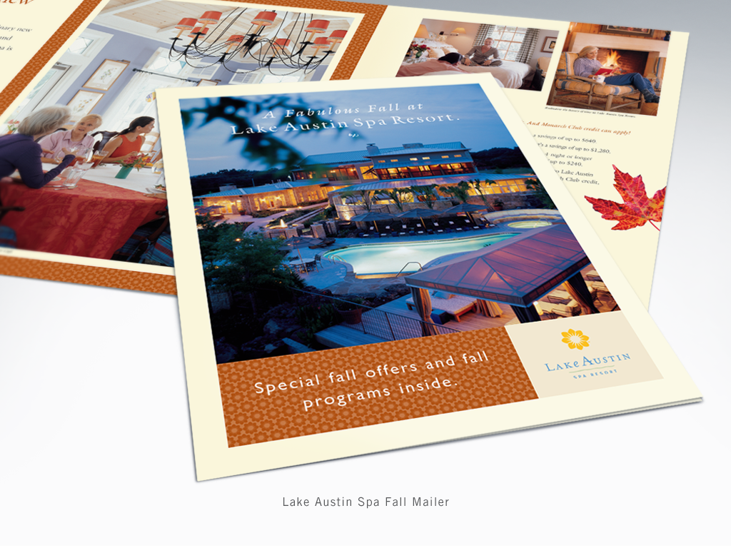
FALL MAILER
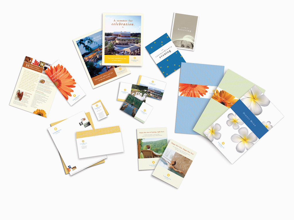
PRINT MATERIALS